Responsive Website Design vs Non-Responsive Website Design: Which Converts Better?
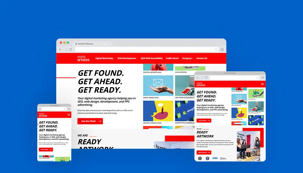
What is a Responsive Website Design?
Let us start with determining what exactly contributes to a responsive design.
A website that has been designed to be responsive will automatically adjust its layour, content, and functionality to accommodate the screen size of the device used by the visitor, whether it be a desktop monitor, a tablet, or a smartphone. The goal of responsive design is to provide users with the best viewing experience, and make it easier for them to navigate and interact with the website, no matter what device they are using. Here are some of the qualities that make a website responsive:
- Fluid Layout: Elements on the website adjust proportionally based on the screen size.
- Flexible Images and Media: Images and media content scale appropriately to fit different screen resolutions.
- Media Queries: CSS rules that apply different styles based on device characteristics such as screen width.
- Mobile-first Approach: Design and development prioritize mobile devices, then scale up for larger screens.
- Touchscreen Optimization: User interface elements are optimized for touch-based interaction on mobile devices.
- Content Prioritization: Emphasis on displaying important content first, especially on smaller screens.
- Cross-Browser Compatibility: Ensuring consistent performance and appearance across various web browsers.
- Fast Loading Times: Optimized performance for quicker loading on mobile and desktop devices.
- Accessibility Considerations: Ensuring that the website is usable by individuals with disabilities across different devices.
- User Experience Focus: Aim to provide a seamless and intuitive experience regardless of the device being used.
Whis is it Important for Websites to Have a Responsive Design?
It’s clear to see that mobile usage has become increasingly more popular over time. Whether you’re at a restaurant, bus stop, cafe, or even at home, users are constantly on their mobile devices surfing the web.
In fact, according to statistics, almost six out of every ten shoppers say that being able to purchase products on mobile devices is a key factor when it comes to choosing brands or retailers to buy from.
And more than half (50.9 percent) of online shoppers worldwide currently use their mobile phones to purchase products online at least once a week. With so many people turning to their mobile devices to do their shopping, as a business owner, one of your priorities should be to ensure that users browsing your website through their phones does not have a negative experience.


In summary: having a responsive website is necessary and crucial for any business. It’s important to cater to your customers by ensuring that they have a user-friendly experience when accessing your website from all forms of channels and from all kinds of devices.
Laptop/desktop users are curious. They shop online because they just want to satisfy that curiosity, not necessarily to buy anything. Mobile searchers are buyers. They have a specific intent in mind of what they want to purchase and all you have to do is meet their needs!
Is Your Website Responsive? We Can Help
Start your journey towards a responsive, user-friendly website! From web design and web development, to various digital marketing strategies like SEO, Paid Ads, Email Marketing—we’ve got you covered!
Ready Artwork is a Digital Marketing Agency located in Los Angeles.


