How to choose primary and secondary colors in web design
Color is a powerful tool in web design. It guides attention, evokes emotions, and shapes user perception. Choosing the correct primary and secondary colors can significantly enhance a website’s usability, aesthetic appeal, and brand recognition. These choices aren’t just about looks; they rely on a strong understanding of color, behavior, and psychological impact.
This article will discuss how to apply color theory effectively in web design. It will explore the function of primary and secondary colors, the emotional influence of different hues, and how cultural perceptions shape common color associations. You’ll also learn how to build a practical color palette, choose the right color scheme, and ensure visual accessibility and consistency across your design.
Key Takeaway:
Start with a primary color that aligns with your brand values and communicates the right emotion. Then, apply color theory to select secondary colors that either complement or contrast the primary hue, enhancing visual hierarchy and usability. Always test your palette for accessibility, cultural relevance, and consistency across devices.
Understand Color Theory and Its Application
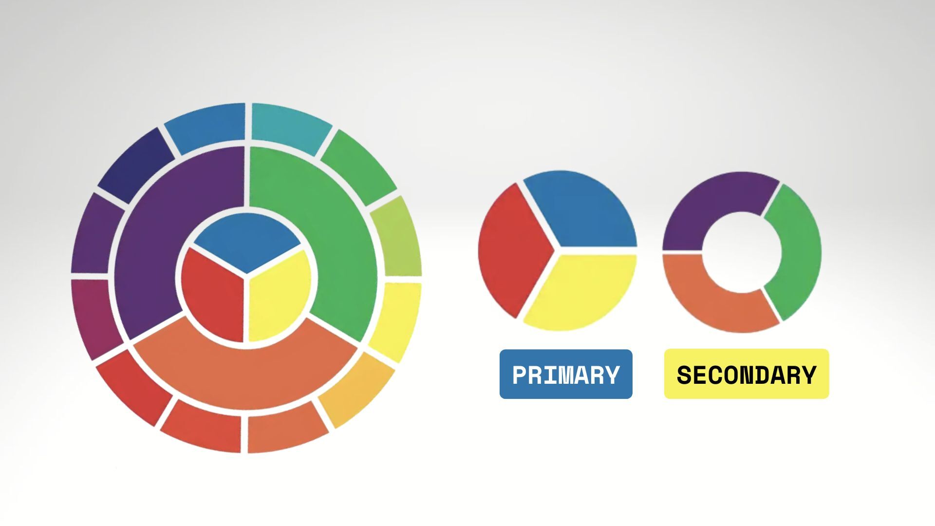
Color theory is a set of principles used to determine how colors interact. At its core is the color wheel, a visual representation that categorizes hues into primary, secondary, and tertiary colors. The additive color model (used in digital design) relies on red, green, and blue as primary colors, while the subtractive model uses red, yellow, and blue.
Primary colors form the foundation of any color palette. Mixing these leads to secondary colors, which can create tertiary colors. Understanding these relationships helps in crafting harmonious color combinations that support the visual and emotional goals of a website. This foundation is essential in creating a balanced and effective website color scheme.
The Psychological Impact of Color Choices
Colors are deeply tied to emotion and perception, a subject of color psychology. For example, blue is often associated with trust and calmness, while red signals urgency or excitement. Your site’s desired emotional tone should be reflected in the color you choose as its main color.
Color psychology can help guide users through content, influence buying decisions, and enhance brand recognition. However, psychological responses can vary based on culture, which is why understanding your target audience is critical. Integrating the fundamentals of color psychology into the design process ensures that the colors used are beautiful and meaningful.
Selecting Your Primary Color
A primary color acts as your site’s visual anchor. It’s the color most closely associated with your brand and often appears in logos, navigation menus, and main call-to-action elements. This color must align with your brand identity and the message you want to convey.
Choosing the right color involves both strategy and creativity. Begin with a thorough understanding of your brand’s values and audience expectations. Use color palette generators or start with a basic color wheel to choose a color that resonates emotionally and stands out visually. Your primary color sets the tone for all supporting hues, including background color and text highlights.
Choosing Complementary Secondary Colors
Secondary colors enhance and balance the primary color, adding depth to the overall design. These colors should be chosen based on harmony and contrast principles. Complementary colors, located on opposite ends of the color wheel, provide high contrast and energy. Analogous colors sit next to each other, offering a more subtle and unified feel.
A triadic color scheme, using three colors evenly spaced on the color wheel, can also bring dynamic balance. Understanding these principles ensures that your secondary colors support and do not overpower the primary color. Effective color choices contribute to a consistent, visually appealing user experience.
Analyzing Cultural Context and Audience Perceptions
Colors carry different meanings across cultures. While white might signify purity in one region, it could denote mourning in another. This variation in color associations underscores the need to research cultural expectations when designing for a global audience.
Audience demographics such as age, gender, and industry should also influence color selection. A financial services website might lean on cool colors like blue or grey to convey professionalism, while a creative portfolio could use vibrant, energetic hues. Choosing your color palette should always determine how your specific user base will receive different colors.

Accent Colors and Color Temperature in Web Design
Accent colors are used sparingly to draw attention to specific elements like calls to action or interactive features. These should contrast nicely with the base color and background while maintaining overall harmony.
Color temperature, cool versus warm colors, also play a critical role in user engagement. Cool colors (like blue and green) tend to calm and reassure, while warm colors (like red and orange) stimulate and energize. A thoughtful mix of both can guide user behavior and emotional response.
Tools for Creating Effective Color Palettes
Modern design tools simplify the process of creating color palettes. Online color palette generators help designers easily explore complementary color palettes, analogous color schemes, or monochromatic color palettes. These tools can assist in creating harmonious color combinations that align with your brand and usability goals.
Understanding the principles of color theory and psychology allows for more confident and purposeful use of these tools. Whether you’re creating color palettes from scratch or refining existing ones, digital resources ensure consistency and creativity.
Testing and Refining Your Color Scheme
The design process doesn’t end with selecting the type of color to use. Testing your website’s brand color scheme in real-world scenarios is essential. This includes evaluating how colors appear across different devices and lighting conditions.
Gathering user feedback and conducting A/B tests can provide valuable insights into which color combinations work best. Adjustments may be needed to maintain the balance between aesthetics and function. Every color palette should be tested and refined until it fully supports usability and engagement.
Ensuring Accessibility and Contrast in Design
Accessible design ensures all users, including those with visual impairments, can navigate and interact with your site. This involves maintaining adequate color contrast, especially between text and background color.
Neutral colors often play a key role in enhancing readability and separating content. A monochromatic color scheme or muted tertiary colors can help ensure clarity without sacrificing design appeal. Web accessibility tools can evaluate your palette’s effectiveness and compliance with standards.
Conclusion
The effective use of primary and secondary colors is more than a visual choice; it’s a strategic decision grounded in a solid understanding of color theory, audience psychology, and cultural context. A well-designed color palette can strengthen brand identity, improve usability, and create a lasting impression.
By applying the principles of color theory, using tools to create a color palette, and refining your choices through testing and feedback, you ensure that your web design is beautiful and functional. Whether you’re selecting a primary color, supporting it with a complementary color, or adding emphasis with an accent color, the goal is to create a visually cohesive and user-centered experience.