Responsive vs. Adaptive Design: Choosing the Right Approach
TL;DR:
Responsive design uses one fluid layout that adjusts to any screen size, while adaptive design creates separate fixed layouts per device. Responsive is easier to maintain, while adaptive offers more precision. Your project goals should drive the choice.
In today’s digital landscape, creating websites that deliver a seamless experience across various devices is crucial. With the wide variety of screen sizes, ranging from mobile phones to desktop computers, web designers must choose the right approach to ensure their site functions optimally on all platforms.
For most B2B websites Ready Artwork builds today, responsive design is our default recommendation. It gives businesses the best balance of flexibility, maintainability, usability, and SEO without requiring separate layouts for specific devices.
We would consider an adaptive or hybrid approach when a website has highly specialized interfaces, application-like functionality, or significantly different user requirements between desktop and mobile.
The important distinction is that responsive versus adaptive shouldn’t be treated as purely a design decision. The right approach depends on your users, content, functionality, performance requirements, and long-term maintenance needs.
In this article, we will explore two popular design strategies: responsive design and adaptive design. We’ll discuss the key differences between these two approaches, the pros and cons of each, and when it’s best to use one over the other. By the end, you’ll have a clear understanding of which design strategy suits your website needs.
What is a Responsive Web Design
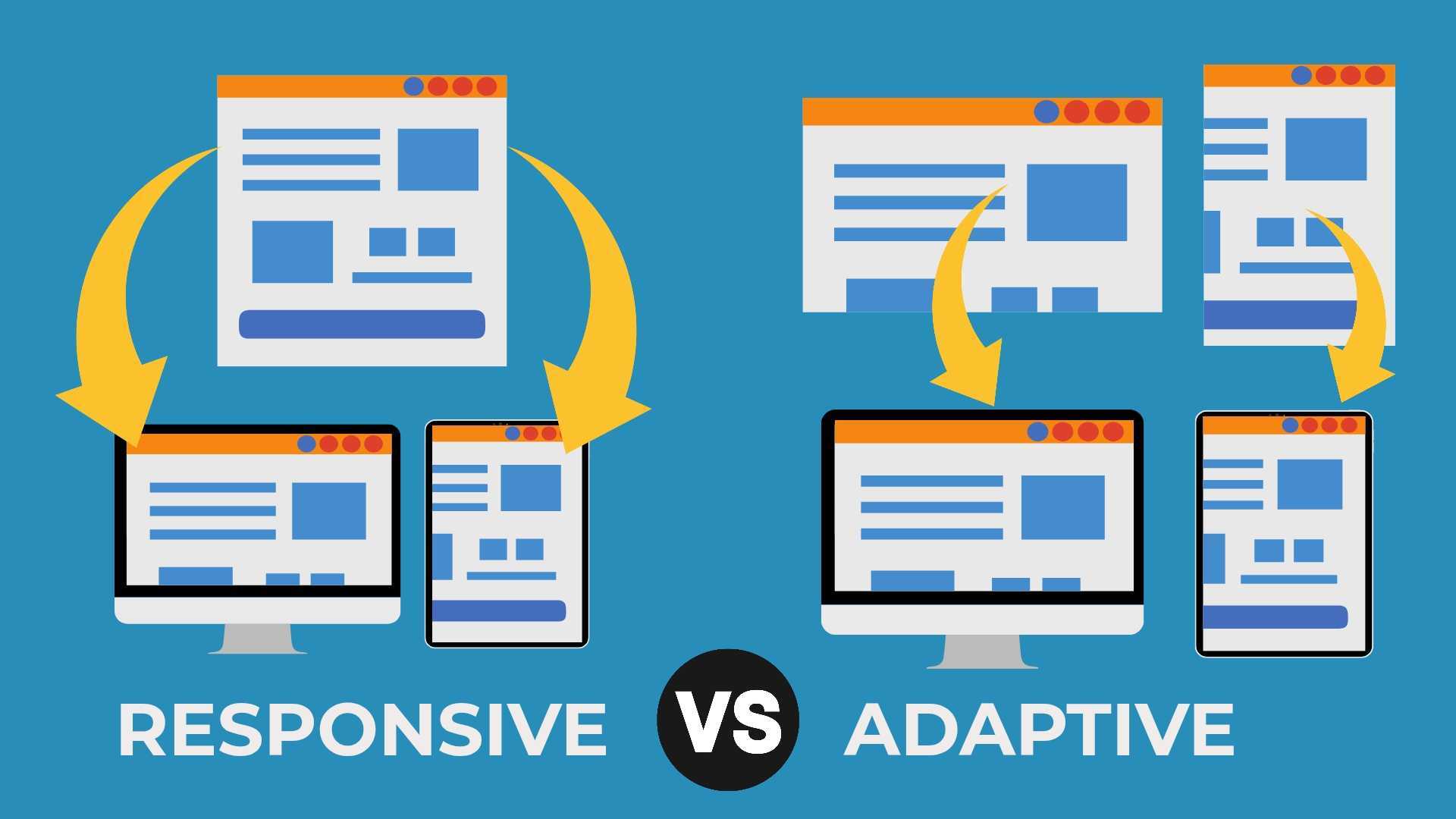
Responsive design is a web design approach that focuses on creating a website layout that adapts fluidly to any screen size and resolution. This design utilizes flexible grids, media queries, and scalable images to ensure the website appears visually appealing on a wide range of devices, from large desktop monitors to small mobile phones. The goal of responsive web design is to ensure that the responsive website delivers a seamless experience regardless of the device’s screen size.
Unlike unresponsive web design, responsive web design works by using a single layout that adjusts dynamically based on the screen’s size, eliminating the need for multiple versions of the site. When a user visits a responsive site, the content and design elements (such as images, navigation, and typography) resize or reposition themselves according to the available screen size. This means that whether you’re viewing a website on a mobile device, tablet, or desktop, the site will always look good and function properly.
Quick Answer: Responsive design is the best starting point for most websites because one flexible layout can support a broad range of screen sizes. Adaptive design is better suited to projects that require carefully controlled, device-specific layouts or functionality.
What is an Adaptive Web Design
In contrast, adaptive website design takes a different approach by creating distinct layouts for specific devices. Instead of relying on a single flexible layout, adaptive web design uses multiple fixed layouts tailored to different screen sizes. The website detects the device’s screen size and delivers the appropriate layout. For example, a mobile version of the site might feature a compact design with larger buttons and a simplified navigation system. In contrast, the desktop version might include more detailed information, complex navigation, and higher-resolution images.
The key distinction here is that adaptive design requires the creation of separate layouts for each device or screen size. This approach can result in faster loading times on mobile devices since the website only loads the elements necessary for that particular screen size. However, it also means that web designers must maintain multiple versions of the site, which can increase development time and complexity.
Definition Box: Responsive web design is a design method in which the same page automatically reflows according to the available viewport. Its core tools include relative sizing, flexible CSS layouts, responsive images, and media queries.
Responsive vs. Adaptive Design: Key Differences
The fundamental difference between responsive and adaptive design lies in how the websites adjust to different screen sizes. Responsive design employs a flexible layout that dynamically adapts to fit any screen. In contrast, adaptive design provides different layouts based on predefined breakpoints, essentially offering a customized version of the website for each device.
Responsive design is more versatile and is suitable for sites that require a single design layout that adjusts across different devices. Responsive websites also tend to have easier maintenance since there is only one version to update. However, poorly optimized responsive sites may deliver unnecessary assets to mobile devices, which can hurt performance. Modern techniques such as responsive images, lazy loading, and conditional loading can significantly reduce this problem.
On the other hand, adaptive design is ideal when precise control over the design elements is required for specific devices. This design often results in better performance on mobile phones and can be optimized for each device’s unique requirements. The downside is the higher maintenance required, as each version of the site must be updated separately. Furthermore, unlike responsive design, adaptive design may struggle to handle new devices or screen sizes without additional adjustments.
Quick Comparison:
| Key Factor | Responsive Design | Adaptive Design |
| Layout | One flexible layout | Multiple predefined layouts |
| Screen Adjustment | Reflows across screen sizes | Switches at set breakpoints |
| Maintenance | Easier to update | Requires more maintenance |
| Design Control | Consistent across devices | Greater device-specific control |
| Best For | Most modern websites | Specialized device experiences |
Pros and Cons of Responsive Design
There are several benefits to using responsive design. One of the major advantages is its flexibility. With a responsive site, the layout automatically adjusts to fit the user’s screen size, eliminating the need for designers to create separate versions of the site for different devices. This can lead to a simpler development process and easier website design maintenance in the long run.
However, responsive design is not without its drawbacks. Since a responsive website uses the same layout for all devices, it can lead to slower load times, especially on mobile phones. This is because the website loads all content, regardless of whether it’s necessary for that particular device. Additionally, certain complex design layouts may not translate well to smaller screens, which can negatively impact the user experience (UX).
Pros and Cons:
Pros
- Flexible across screen sizes
- Easier to maintain
- Consistent user experience
Cons
- May load slowly on mobile
- Less device-specific control
- Complex layouts can be challenging
Pros and Cons of Adaptive Design
Adaptive design can be optimized to deliver fewer or lighter resources to a specific device, potentially improving performance. However, actual speed depends more on implementation, assets, code, hosting, and optimization than on whether the site is responsive or adaptive. For instance, a mobile version of the site might deliver smaller images and simpler content, resulting in faster loading times. Additionally, adaptive design allows web designers to tailor the user interface (UI) specifically to the capabilities of each device, thereby enhancing the overall user experience.
The primary downside of adaptive design is the additional work required to maintain multiple versions of the website. This can be time-consuming and costly, especially for large websites with many device-specific layouts. Furthermore, adaptive design requires more design elements and a greater level of design strategy to ensure consistency across devices. Adaptive design may also encounter issues with new devices that weren’t originally accounted for in the layout.
Pros and Cons:
Pros
- Greater device-specific control
- Faster mobile performance
- Tailored user experience
Cons
- Higher maintenance costs
- Longer development time
- Limited support for new screen sizes
When to Use Adaptive vs Responsive Design
Choosing between responsive and adaptive design depends on the project’s goals and needs. If the goal is to create a website design that is flexible and requires minimal maintenance, responsive design is typically the better option. It’s ideal for smaller websites or projects that need to scale easily across multiple devices without requiring extensive custom development.
However, if the project requires a more customized design layout for different devices or focuses heavily on mobile optimization, adaptive design may be a better fit. This approach is particularly useful for sites that demand high performance on mobile devices or require specific layouts that are difficult to achieve with responsive design.
Quick Answer:
- Choose responsive design for flexibility, easier maintenance, and broad screen compatibility
- Choose adaptive design for device-specific layouts, precise control, and specialized performance needs
Adaptive and Responsive Design in UX and UI Design
Both responsive and adaptive design play crucial roles in user experience (UX) design. With responsive layouts, designers can create a consistent user experience across devices, ensuring that content is accessible and readable on any screen size. This is especially beneficial for interaction design, where usability and navigation are key to the user journey.
Adaptive design, on the other hand, allows for more control over the user interface on different devices, making it a great choice for mobile design or sites with specialized needs. The adaptive design approach can be particularly effective in delivering optimized content for various devices, thereby creating a more personalized user experience.
Key Takeaway: Responsive design creates a consistent user experience across screen sizes, while adaptive design offers greater control over device-specific interfaces. Both should prioritize clear navigation, readable content, and easy interactions.
Conclusion
In conclusion, both responsive design and adaptive design have their unique strengths and drawbacks, and the choice between them largely depends on the specific project requirements. Responsive design offers flexibility and ease of maintenance, making it ideal for simpler websites that need to work across various devices. Adaptive design, on the other hand, provides tailored experiences for specific devices, ensuring optimized performance and user engagement.
Web designers must carefully evaluate the nature of their project, the intended user base, and the devices they wish to support to select the most suitable approach. Whether opting for the dynamic adaptability of responsive design or the customized precision of adaptive design, both strategies offer powerful ways to create a mobile-optimized, user-friendly web experience.
Frequently Asked Questions
Q1: What’s the simplest way to know if a website is responsive or adaptive?
Resizing the browser can give you clues, but it isn’t a definitive test. Responsive layouts typically reflow fluidly using CSS and media queries, while adaptive sites use a set of predefined layouts. Developers may need to inspect the site’s CSS, HTML, or server behavior to determine which approach is being used.
Q2: Can you combine responsive and adaptive design in one project?
Yes, many websites use a responsive foundation and layer in device-specific adjustments where needed, especially for complex features like dashboards or e-commerce product pages that need tighter control on mobile.
Q3: Does responsive design hurt your site’s load speed on mobile?
It can. Since responsive sites typically load the same assets regardless of device, mobile users may end up downloading content that isn’t even displayed on their screen. Techniques like lazy loading and responsive images help reduce that overhead.
Q4: Which approach is better for SEO?
Google recommends responsive web design because it’s generally the easiest mobile configuration to implement and maintain. Responsive design also typically uses the same URL and content across devices, simplifying crawling, indexing, and ongoing SEO management.
Q5: If I’m building a new site from scratch, which should I start with?
For most new projects, responsive design is the smarter starting point. It’s more cost-effective, easier to maintain long-term, and works well across the wide variety of screen sizes you’ll encounter. Adaptive design makes more sense when you have very specific performance or UX requirements for a particular device type.