How to Choose the Right Typography for Your Website
Typography is one of the most influential yet underappreciated elements in web design. It shapes how users perceive content, interact with it, and navigate through a website. The wrong font choice can make a site feel unpolished or hard to use, while the right one supports clarity, trust, and a consistent user experience. Choosing typography isn’t about picking the trendiest font; it’s about making strategic, brand-aligned decisions that serve both form and function.
Key Takeaway:
The right website typography improves readability, brand consistency, and user experience across devices. Limit fonts to a cohesive set, ensure accessibility standards are met, and optimize font files for faster performance.
Understanding Typography’s Role in Web Design
Typography is more than the appearance of letters—it’s a functional component of design. It establishes visual hierarchy, guides a reader’s eye through content, and contributes to the overall feel of the site. Headings, body text, and calls to action all rely on typographic contrast to organize information and direct user attention.
When used well, typography reduces friction by making content easy to scan, read, and engage with. It doesn’t just decorate a website; it structures how information is absorbed and helps users make sense of what they are viewing. This makes typography a cornerstone of user experience rather than a secondary design choice.
Matching Typography to Your Brand Identity
Font selection should reflect the tone and personality of the brand. A luxury brand may benefit from elegant serif fonts that convey sophistication, while a tech startup might lean into clean, modern sans-serif fonts to suggest innovation and simplicity. Every typeface communicates something even subconsciously, and users form impressions before they read a single word.
When typography aligns with your brand’s visual system, it reinforces recognition and trust. Consistency across marketing, web design, and content creates a seamless identity. This isn’t about aesthetic preference; it’s about strategic decisions that make your brand instantly recognizable and credible.
Readability and Legibility Across Devices
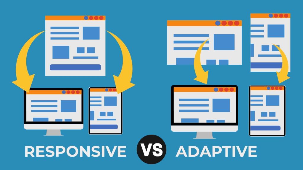
Typography must work well across desktops, tablets, and smartphones, but what looks clear on a wide screen can quickly become cluttered on a smaller device. Responsive typography ensures line length, font size, and spacing adapt to different screens without sacrificing clarity. These adjustments directly affect how comfortably users can consume content, especially on mobile, where most browsing now happens.
Equally important is font selection. Highly stylized typefaces with tight letterforms or exaggerated curves may look appealing in a headline but quickly lose readability in longer passages of text. Prioritizing fonts designed for digital use keeps content accessible and prevents unnecessary friction across platforms.
Strategic Font Selection and Pairing
Effective typography rarely involves more than two or three typefaces. Limiting your selection avoids visual clutter and strengthens cohesion across the site. Choosing fonts with distinct roles, such as one for headings and one for body copy, creates a system that feels intentional and disciplined.
Pairing fonts requires contrast but also harmony. A bold, attention-grabbing display font for headers can be balanced with a neutral, highly legible font for paragraphs. Fonts that share compatible proportions, spacing, or moods tend to pair more naturally. Too much variation introduces inconsistency, while well-structured contrast guides the reader effortlessly through content.
Evaluating Font Versatility and Customization
Versatility refers to how well a typeface performs across weights, styles, and sizes. A well-designed font family should include multiple weights (light, regular, bold) and styles (italic, condensed, extended) to support layout flexibility. Customization, through letter spacing, case usage, or stylistic alternates, can fine-tune how a font fits into your design. Versatile fonts save time and maintain consistency across diverse content blocks. This adaptability becomes especially important for content-heavy sites that rely on visual variety within a structured design system.
Tools like Google Fonts and Font Squirrel can help test and compare typefaces across weights, sizes, and languages. These platforms also provide performance-optimized files and previews for web usage, making them valuable for both selection and implementation.
Considering Your Audience’s Needs
Typography must serve the people reading it. A younger audience might prefer bold, dynamic fonts, while older users benefit from larger sizes and higher contrast. If your content is multilingual, you need fonts with wide character support. For formal or technical audiences, clarity and neutrality are more effective than decorative type. Good typography choices respect the expectations, limitations, and preferences of your users, particularly when accessibility is a priority.
Aligning with WCAG (Web Content Accessibility Guidelines) helps ensure that your typography meets inclusive standards. This includes maintaining high color contrast between text and background, choosing readable font sizes, and using sufficient line spacing to aid those with visual or cognitive impairments.
Typography and Site Performance
Web fonts can significantly affect load times, particularly if multiple weights or oversized file formats are used. Since performance directly impacts user experience and search rankings, optimizing font usage is a technical requirement as much as a design one. Using modern file types like WOFF2 reduces size without sacrificing quality, while hosting fonts locally or preloading them can prevent layout shifts during page load.
Every font added to a project should be justified in terms of necessity. Streamlining your selection reduces requests to the server, speeds up performance, and ensures design decisions do not come at the expense of functionality.
Creating a Cohesive Visual System
Typography interacts with every other design element, from layout grids to colors and imagery. Consistency in type scales, spacing rules, and hierarchy creates a rhythm that unifies the entire design. When headings follow predictable patterns and paragraphs share consistent spacing, the site feels structured and intentional.
This cohesion goes beyond aesthetics it affects usability. Predictable typographic patterns help readers instantly recognize sections, distinguish between importance levels, and move fluidly through the content. A cohesive system ensures typography doesn’t just look good but actively supports navigation and comprehension.
Conclusion
Choosing the right typography for your website requires intentional decisions that prioritize readability, responsiveness, and brand consistency. Effective typography structures content clearly, supports user engagement, and strengthens your brand’s message. By focusing on both form and function, you ensure your website delivers a seamless, accessible, and professional experience for all users.