What Are the Most Common Breakpoints for Responsive Design?

Responsive design has become the standard for modern websites, ensuring content looks and functions well across smartphones, tablets, laptops, and large desktop monitors. At the core of responsive design are breakpoints, the points where a website’s layout adjusts to different screen sizes. Understanding breakpoints is essential for developers, designers, and businesses, who want to deliver seamless user experiences across devices.
What Is a Breakpoint in Responsive Design?
In web development, a breakpoint is a defined screen width where a website’s layout adjusts to improve usability and readability. For example, when moving from a smartphone to a desktop, elements like navigation menus, images, and text need to adapt automatically. Breakpoints make this possible by signaling the design to “respond” to the device.
These adjustments are usually implemented through CSS media queries, which apply different style rules depending on the device’s width. This ensures that websites remain functional, legible, and visually consistent regardless of screen size.
For businesses, understanding how different breakpoints work is crucial, and finding the best web design agency can help ensure that your site is built to optimize performance across all devices.
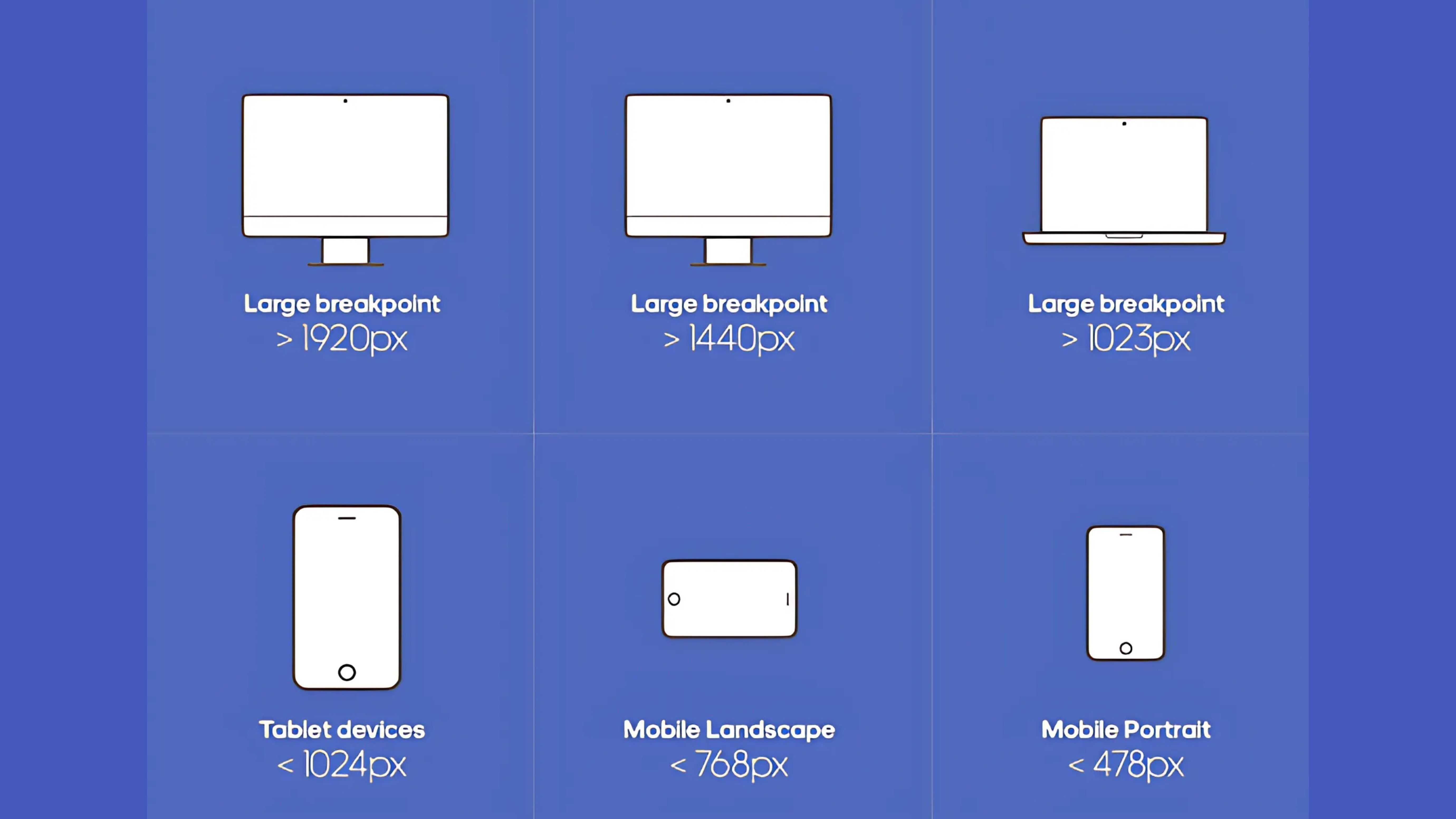
The Most Common Breakpoints
While breakpoints can be customized depending on project needs, most developers rely on widely recognized standards based on common device widths:
- 320px – Small mobile devices (older iPhones, compact Android phones)
- 375px – Modern smartphones (iPhone X, Samsung Galaxy S series)
- 425px – Larger phones or small phablets
- 576px – Landscape phones and small tablets
- 768px – Tablets in portrait mode (e.g., iPad)
- 992px – Tablets in landscape mode or small laptops
- 1200px – Standard desktop monitors
- 1600px and above – Large desktops and wide screens
These values act as starting points, not rigid rules. Designers often fine-tune breakpoints based on the actual content and functionality of their website rather than device categories alone.
Why Breakpoints Matter
Breakpoints exist to ensure that websites are readable, usable, and accessible across different devices. Since users interact with websites on screens ranging from small phones to ultrawide monitors, breakpoints allow layouts to shift intelligently for optimal viewing.
They typically affect:
- Layout structures – Columns and grids rearrange for better readability.
- Typography – Font sizes and spacing scale appropriately.
- Navigation – Menus collapse into icons or expand depending on screen size.
- Media – Images and videos resize or shift to maintain proportions.
By creating predictable thresholds for these changes, breakpoints make websites feel seamless across platforms.
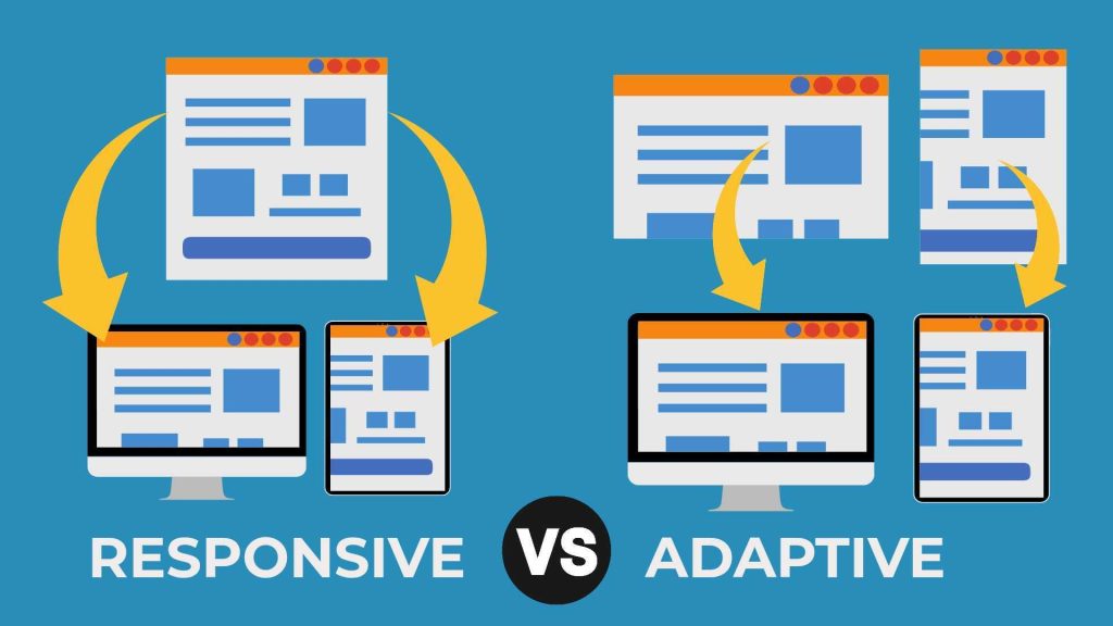
Fluid Design Between Breakpoints
While breakpoints define where changes occur, good responsive design also accounts for what happens between them. Instead of snapping from one layout to another, fluid design uses relative units (%, em, rem) to ensure elements scale smoothly across all screen widths. This combination of breakpoints and fluidity prevents awkward gaps, overlaps, or cramped layouts.
Best Practices for Breakpoints
Best practices for breakpoints in responsive web design involve starting with a mobile-first approach, where layouts are designed for smaller screens first and then scaled up for larger devices. Developers should rely on relative units such as em, rem, and percentages rather than fixed pixels to optimize flexibility across different breakpoints.
Testing designs thoroughly on real devices, instead of just simulators, helps ensure functionality and usability in real-world conditions. It’s also important to limit the number of breakpoints, focusing only on essential adjustments to simplify development and long-term maintenance.
Finally, maintaining consistency in typography, spacing, and imagery ensures that the user experience feels seamless and cohesive across all screen sizes.
Tools and Frameworks for Breakpoints
Several tools and frameworks make it easier to implement and manage breakpoints in responsive design. At the core are CSS media queries, which allow developers to apply different styles based on viewport width and other device characteristics.
Popular frameworks such as Bootstrap, Tailwind CSS, and Foundation offer built-in breakpoint systems that simplify the process, Bootstrap uses predefined breakpoints, Tailwind CSS provides utility-first customization options, and Foundation offers a flexible grid system.
In addition, browser developer tools like Chrome DevTools and Firefox Responsive Design Mode enable real-time testing of various screen sizes and orientations, helping developers refine their designs for optimal performance across devices.
Common Mistakes to Avoid
When working with breakpoints, developers often run into issues such as:
- Designing only for specific devices rather than flexible layouts.
- Adding too many breakpoints, complicating development and performance.
- Overlooking performance optimization, causing slow load times at certain widths.
- Testing only in simulators instead of real devices with real users.
Avoiding these pitfalls ensures that breakpoints truly enhance usability instead of creating unnecessary complexity.
Why Do We Need Responsive Web Design?
Responsive web design is necessary because users access websites on a wide range of devices, from small smartphones to large desktop monitors. Breakpoints make this possible by defining where layouts adjust for different screen sizes, ensuring optimal viewing experience and navigation remains intuitive.
For businesses, responsive design improves user experience, reduces bounce rates, and boosts SEO since Google favors mobile-friendly sites. It also lowers development costs by removing the need for separate desktop and mobile versions. By leveraging different breakpoints effectively, companies can optimize usability, engagement, and conversions across all devices.
Conclusion
Breakpoints are a foundational concept in responsive web design, enabling sites to adapt their layouts to different screen widths and devices. By thoughtfully implementing breakpoints through CSS media queries, focusing on fluid design, and prioritizing mobile-first principles, developers can create websites that offer exceptional user experiences across the full spectrum of device sizes. Ultimately, breakpoints help ensure that your content is accessible, usable, and engaging, no matter how it’s viewed.